The Predecessor to Mobile-Friendly Websites

It seems like just yesterday that the best thing a website could provide for its users was a “mobile version” of itself. This was pretty straightforward. You would open up a site on your smartphone and it would resemble a jumbled-up puzzle, or would show only a portion of the site’s content. You may have had to scroll left or right to see the rest of the content– or you may not have been able to see the rest at all. But not to worry - glide downward and many websites would have a line of small-print text reading “switch to mobile version”. Click on this text, and the site would shift to a simplified form of the full version, one that fit perfectly to your screen and was easy to navigate.
There was a drawback though: often these mobile versions were much less satisfying to use – maybe you couldn’t find certain features or maybe it just looked too bare. Whatever the reason, you sometimes would find yourself re-checking the site on your laptop later, reveling in the beauty and completeness of the "full version". One of the main features of mobile sites was the required difference in URL from the original site. Most websites chose a URL such as companyname.com.
What Mobile-Friendly Means Today
Fast forward to 2015, and the then-innovative concept of the mobile version is already dated. We need something else to mollify our selective users – particularly in the real estate industry where people are not always surfing for entertainment reasons, but to make weighty life decisions. Current statistics show that 90% of adults in the US own a cellphone, 64% a smartphone and 42% own a tablet. About 7 out of 10 owners go online with their phone, and approximately 7 out of 20 use the internet on their phone more than on any other device. A company needs to be tech-savvy to adapt to the current climate, and JBGoodwin REALTORS® are on top of the game. Our responsive and flexible design is a dream for users browsing with smartphones and looks great from any platform or device - in fact it’s the same great website you’re used to seeing on your laptop or desktop computer!
Using Mobile-Friendly Technology To Advance Austin Real Estate
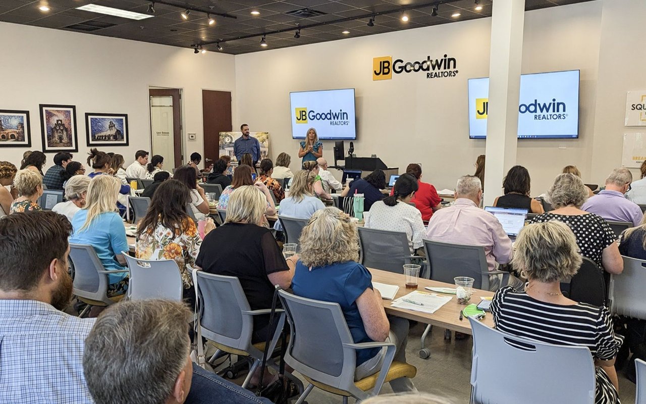
In the Austin area, JBGoodwin REALTORS® is a frontrunner for mobile-friendly websites and this is an unbeatable boon for homebuyers and sellers. People who are searching for real estate opportunities have jobs and obligations, and don’t always have time to sit down at home to spend large blocks of time looking for updates and new information. With our first-class, mobile-friendly setup, users can just as easily receive updates and changes to listings on breaks during other engagements without compromising any level of quality.
A mobile-friendly layout is no longer a luxury, but a necessity. Hitches such as difficult clickability, flawed sizing that requires constant zooming (which may or may not help) and forms that are challenging to fill out, will frustrate the user and cause them to give up. If they don’t give up, it’s likely that they will go forward with low expectations - which doesn’t help anyone!
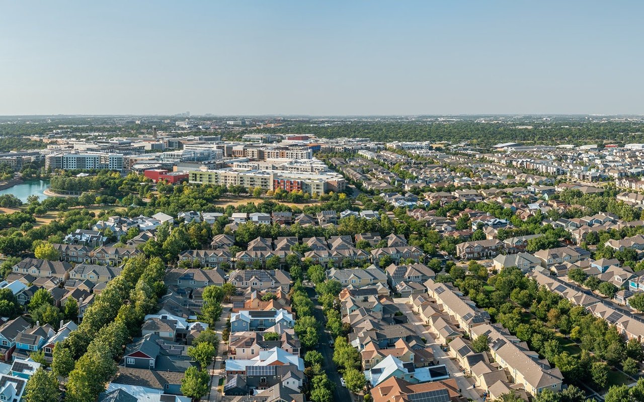
Austin is one of the hottest real estate markets in the U.S. right now and we’re home to an active, busy populace, rich with professionals and tech connoisseurs. Real estate is our municipal pastime, so why not make it easy for everyone? JBGoodwin REALTORS® has recognized Austin’s prime market and has done just that. It’s truly a sensational time for Austin real estate and constant innovation keeps things fresh and exciting. Check out exactly what you can do with our mobile-friendly website now!